Beukenhaag.be — my first commercial website
The 2019 site for a Belgian beech-hedge grower — my first client website. A full-bleed hero, three clear products, and a lead-gen funnel, revisited honestly.
Role · Designer + front-end · first commercial site
What this covered
- First paid client website — a beech-hedge (Fagus / Carpinus) grower in East Flanders.
- Full-bleed photographic hero that sells the product before a word is read.
- Three products, three clear paths: green beech, red beech, hornbeam.
- Lead-gen by design: a single 'request a quote' CTA, backed by a free planting demo.
- Part of a small network of sibling garden sites, cross-linked for local SEO.
Discipline
The brief
A grower near the centre of East Flanders sold beech-hedge plants — green beech, red beech and hornbeam — straight from the nursery, with 20 years behind them and a free planting demonstration on pickup. They didn't need a shop so much as a shopfront: a site that looked trustworthy, explained the difference between the three plants, and turned a search for 'beukenhaag' into a quote request or a visit. It was the first website someone paid me to design and build.
Sell with the photograph
Beech hedges are beautiful, so the site leads with one — a full-bleed avenue of clipped hedge under a big sky, the name laid over it, and a single 'discover more' cue. No stock-photo clutter, no carousel. For a local grower competing with faceless garden centres, that one honest image did more selling than any paragraph could, and it set the calm, green tone for everything below.
Three products, three clear paths
The whole catalogue is really three plants, so the page treats them that way: green beech (Fagus sylvatica), red beech (Fagus sylvatica 'Atropunicea') and hornbeam (Carpinus betulus), each a photo card with its Latin name and one 'meer info' path. Below them, everything funnels to a single call to action — request a quote — reinforced by the human hook of a free planting demo. One decision to make, one button to press.
Built for local search
The site sat inside a small constellation of sibling domains — groenebeuk.be, rodebeuk.be, haagbeuk.eu, online-tuincentrum.be — cross-linked and each targeting the exact phrase a customer types. It's blunt by today's standards, but for a regional grower in 2019 that local-SEO network, plus clear product naming and a newsletter sign-up, was a pragmatic way to show up first for 'beukenhaag'.
What I'd do differently now
Looking back, the bones are sound — strong hero, clear IA, one obvious action — but the craft has room. I'd tighten the typographic scale and vertical rhythm, give the CTA a stronger, more consistent treatment, cut image weight for a faster first paint, and hold the whole thing to a real accessibility bar (contrast, focus states, alt text) rather than an implicit one. It's a useful marker: the instincts that show up in my work today — lead with the product, remove choices, make the next step obvious — were already here on the first paid job; everything since has been sharpening the execution.
Screens
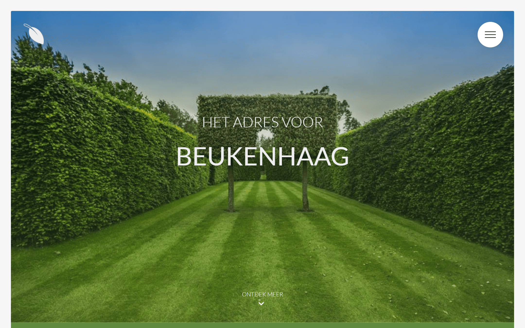
Hero
Full-bleed hedge photography with the name overlaid and a single scroll cue. The product sells itself before any copy.
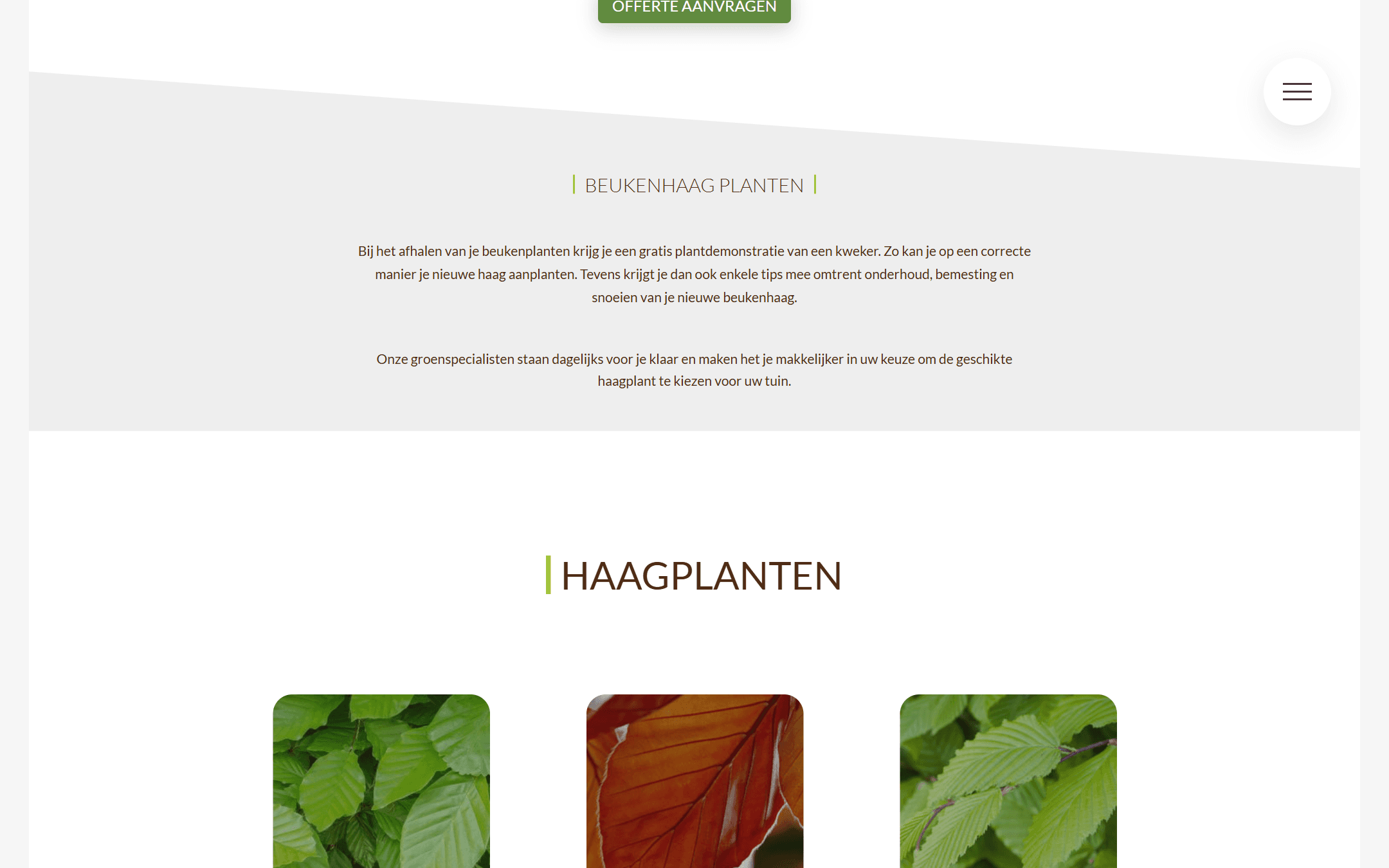
The three products
Green beech, red beech and hornbeam as photo cards with Latin names and a single 'more info' path each.
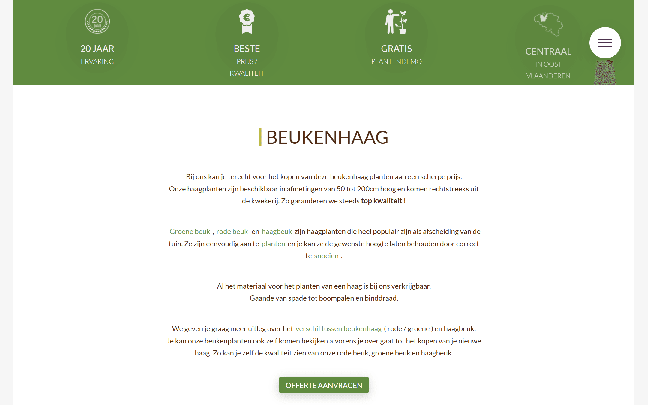
One clear action
The intro explains the plants and funnels to a single 'request a quote' button, backed by the free planting demo.