PowerWeight — brand and icon system
Brand mark, character illustrations and a flat-icon library for a personal-trainer mobile app. Published on Behance.
Role · Designer · illustrator · brand
What this covered
- Full identity in one constrained palette — primary mustard, near-white, charcoal.
- Character illustrations doubled as empty-state art and avatar choices.
- Flat icon library (calendar, pins, charts, mail, etc.) so every screen reads as one product.
- Screencast of the app running, paced for ~30 seconds of attention.
Discipline
The brief
PowerWeight was a personal-trainer mobile app concept — workouts, calendar, body progress. The brand had to read as friendly and approachable on a screen the size of a hand, not gym-bro and not corporate-wellness. So: rounded geometry, one accent colour, and characters that looked like people you'd actually be coached by.
Why a tight palette
Three colours total: mustard for accents and brand, off-white for surfaces, charcoal for outlines. With this little to work with, hierarchy has to come from weight, shape and spacing — which means every icon and illustration gets stress-tested. If a glyph reads at 24px in mustard, it reads anywhere.
Characters before screens
The illustrations got drawn first, before any UI was wireframed. They had to carry the brand voice on their own — same proportions, same outline weight, same eye treatment. Once the character system held together, the rest of the UI just had to not get in their way.
Icons as a single family
Every utility icon shares the same rounded corners, same outline thickness, same proportion of negative space. Calendar, location pin, chart, mail, gear — drawn as a set so they sit together on a screen without anyone needing to think about it.
In motion
The app in motion — onboarding, workout library, calendar, progress tab. Recorded on a real device, no edits.
Screens
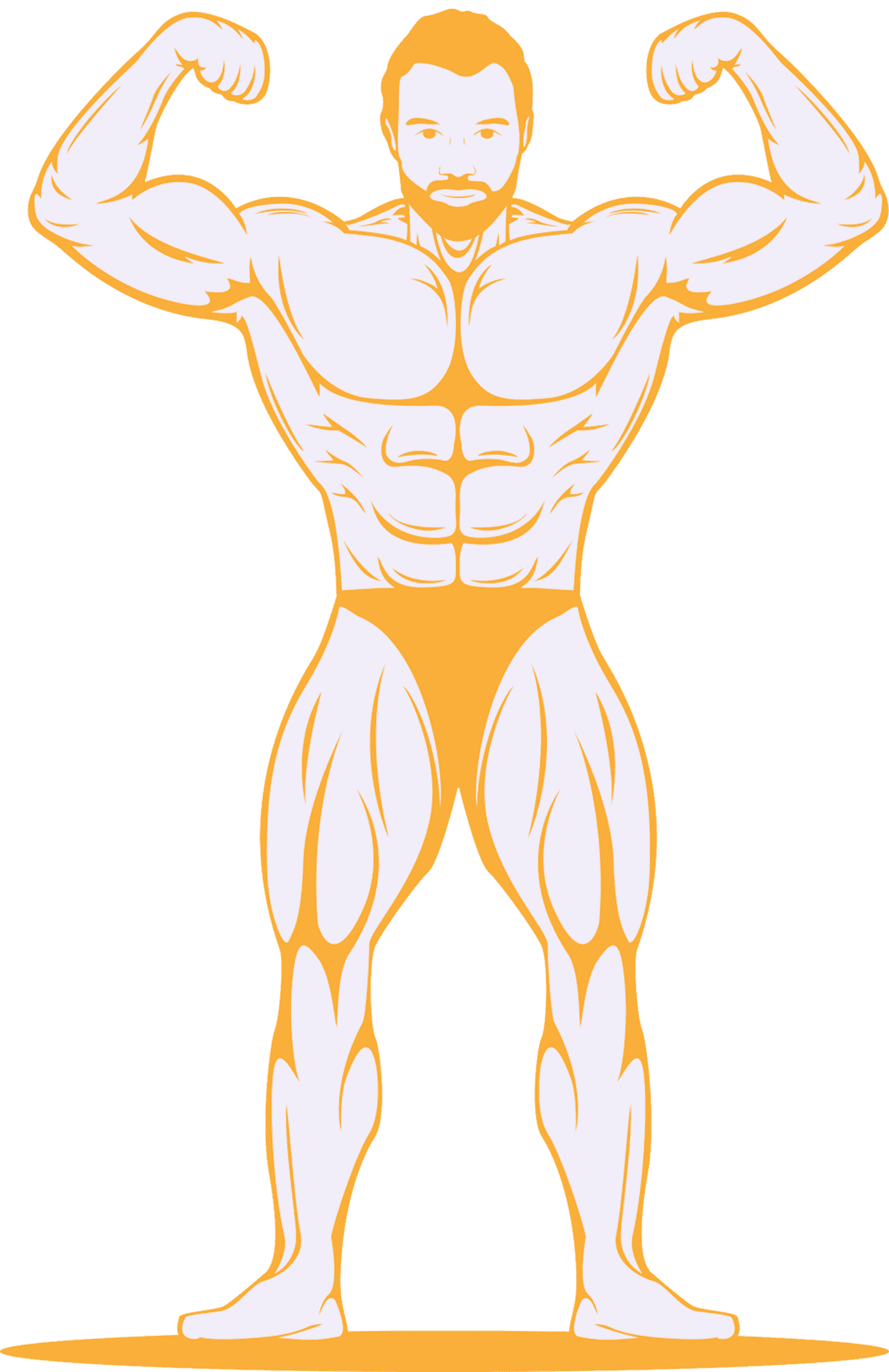
Hero illustration
The flagship character. Used as the app's launch screen and as the empty state on the workout library.
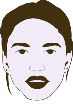
Coach avatars · outline
Outline variants for picker rows. Same head proportions across all avatars so the row reads as one set.
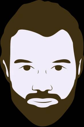
Coach avatars · the pair
Matched male / female pair. Built so swapping coaches in onboarding doesn't change the visual rhythm of the screen.
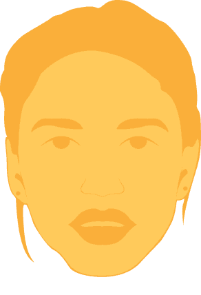
Filled variant
Filled treatment for the larger profile-header use. Same character, second voice — quieter when surrounded by white space.
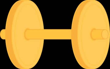
Brand mark · filled
The dumbbell as the literal brand. Mustard fill, used in the logo lockup and as the launch-screen anchor.

Brand mark · outline
Outline treatment for in-app use where the filled mustard would compete with content. Same icon, lower volume.

Calendar — utility icon
Workout-schedule glyph. Same outline thickness and corner radius as the rest of the library so it sits in any row.

Pin — gym location
Geo pin for the gym-finder. Stripped to a silhouette so it reads at any size.

Progress — chart icon
Progress / analytics tab. Same square footprint as every other tab-bar glyph, no special-case treatment.

Mail — notifications
Notification glyph. Drawn with the same envelope flap proportions used in the rest of the system.