Smartphoto group — multi-market eCommerce
Four years in-house on front-end and UX for the group's public storefront — photobooks, prints and personalised gifts — across European markets.
Role · Front-end developer · UX / UI
What this covered
- Front-end and UX in-house from 2018 to 2022, across the group's European storefronts.
- Worked on the surfaces customers use daily: homepage, search, category browsing and the account flow.
- 500+ personalisable products — photobooks, wall décor, prints, cards, gifts — behind one configurator funnel.
- Multilingual, multi-market eCommerce: one storefront, many locales and currencies.
- Research and usability testing feeding directly into the interface work.
Discipline
The storefront, in scale
Smartphoto has printed photos since 1964 and sells online across Europe: photobooks, prints, wall décor, cards, calendars and hundreds of personalised gifts. That's a catalogue measured in hundreds of configurable products, each with variants, designs and price tiers, served in multiple languages and currencies. My four years in-house were spent on the public surfaces of exactly that machine — the pages customers touch every day.
Where I worked
Front-end and UX on the homepage, the search and category-browsing experience, and the account flow — built in HTML, CSS, JavaScript and React, responsive and mobile-first across devices. The work sat at the seam between design and engineering: turning research into interfaces and interfaces into shipped, tested front-end code on a live commercial storefront.
Browsing that survives a huge catalogue
A catalogue this deep lives or dies on findability. The category pages lean on faceted filtering (by recipient, style, colour, photo count) and clear, review-backed product cards, so a visitor can go from 'I want a photobook' to the right template among a hundred-plus designs without drowning. Getting people from intent to the editor is the whole game.
Research in, interface out
The interface decisions weren't guesses. User research and usability testing fed straight into the front-end work — the loop between watching people use the storefront and changing it was short and deliberate. (Findings, internal tooling and anything unreleased stay under the NDA; what's shown here is only the public storefront.)
Screens
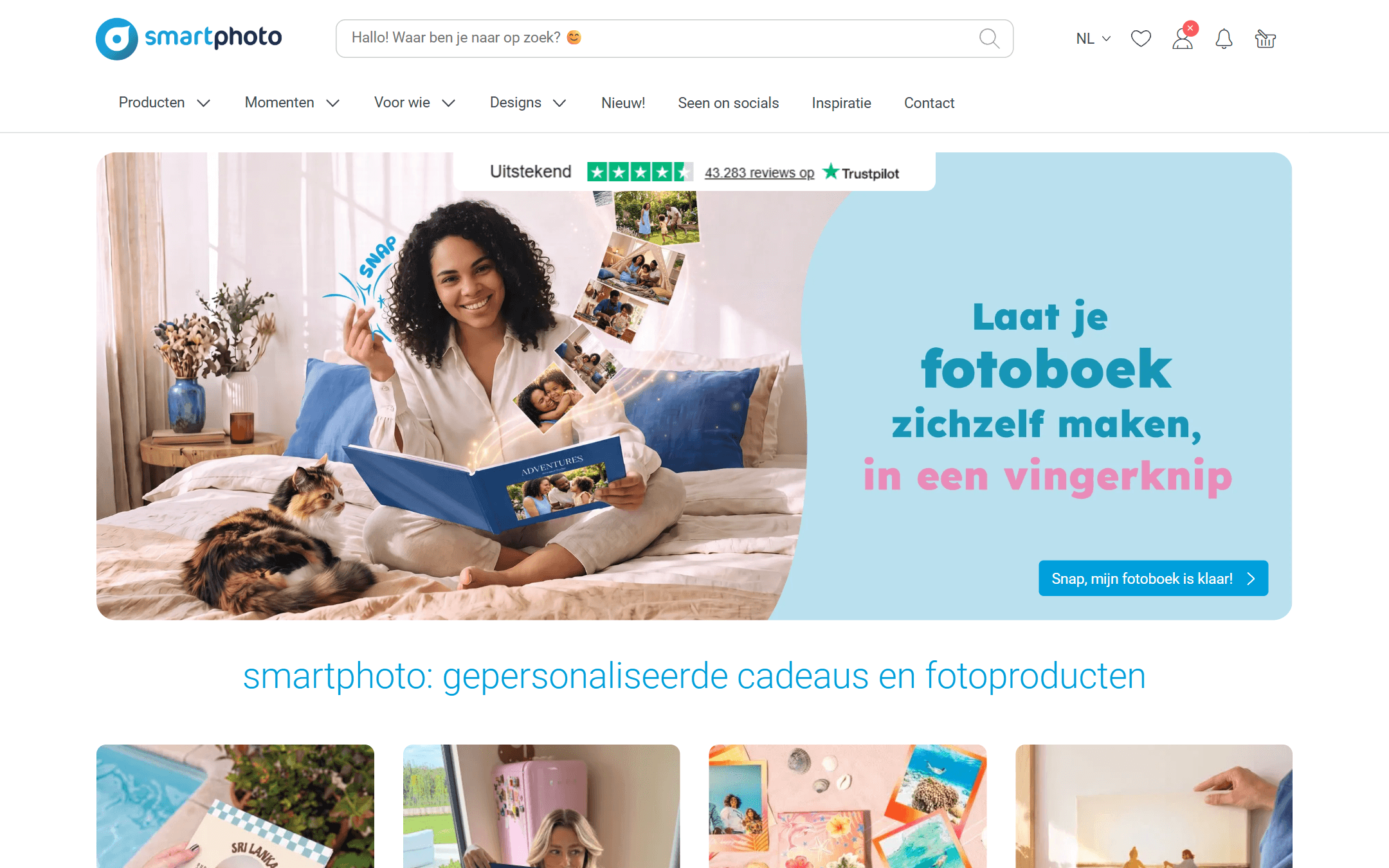
Homepage
The public storefront: prominent search, category navigation, review social-proof, and the personalised-gift hero. One of the surfaces customers hit first.
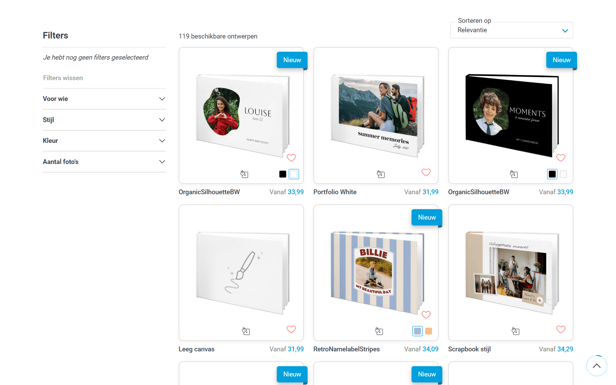
Category + filters
Faceted browsing across 100+ photobook designs — filter by recipient, style, colour and photo count, with review-backed product cards.

Product families
Gifts, photobooks, prints, wall décor, cards, calendars and labels — a broad catalogue organised so intent maps quickly to a product.
No internal material shown.
This work is covered by a non-disclosure agreement. The summary above describes only the public-facing product and my role on it — internal screens, research and design rationale stay where they belong, and are not available on request.